Impact-Site-Verification: 41b53a0c-6d04-458b-a457-fe9e29acde1a

Other··3 min read

Brolly

A plain-text weather forecast that strips away the noise, focusing on readability and shareability.

NN

NewName Editorial

Editorial Team

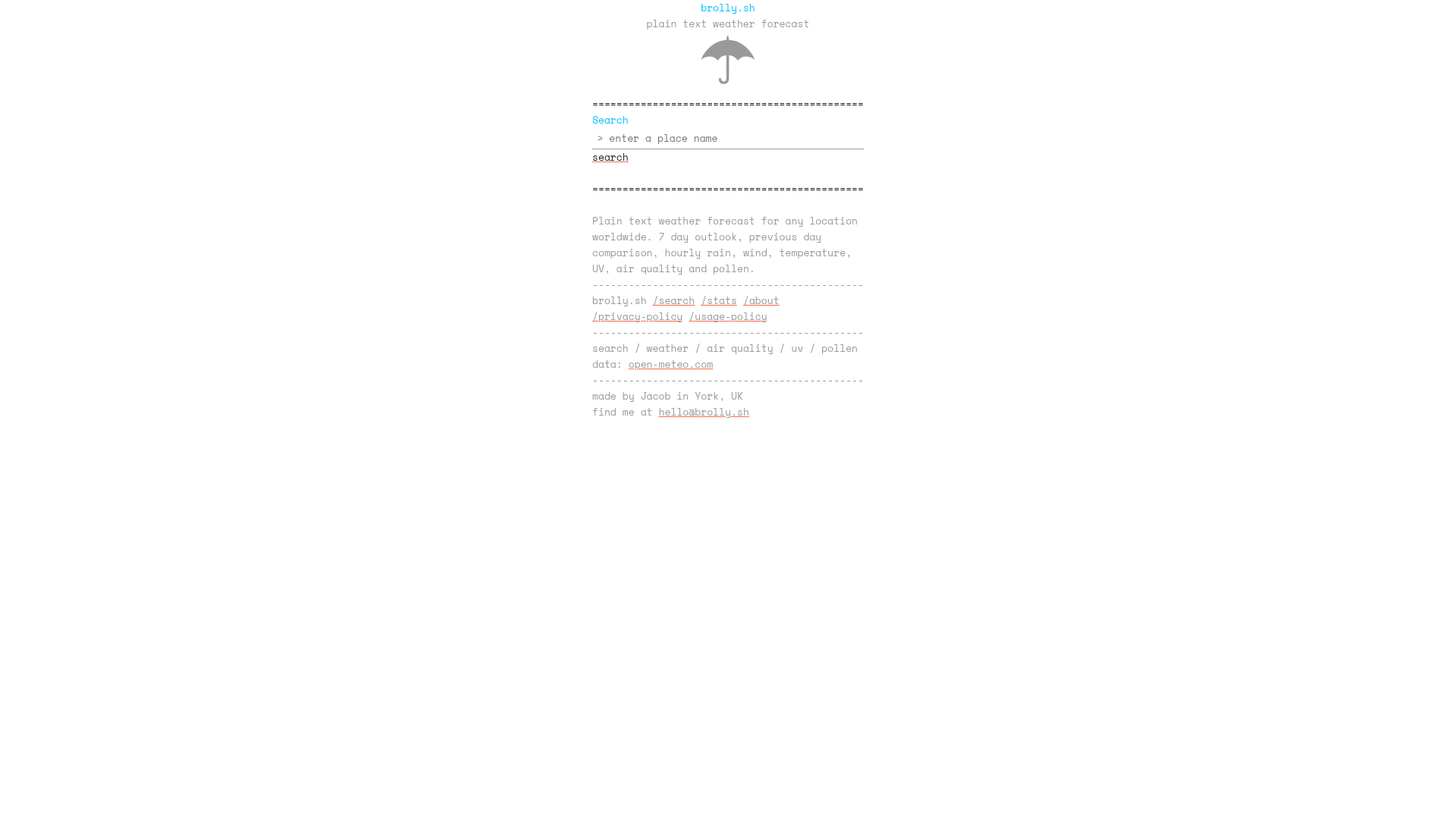
Brolly product image 1

Weather apps are a crowded market, each vying for attention with animated radar maps, glossy gradients, and push notifications. Brolly takes the opposite approach: a plain-text forecast site that looks like a terminal output from 1985. But this isn't a nostalgic gimmick. Brolly's minimalism is a deliberate design philosophy that prioritizes readability, shareability, and honesty over visual flair. It's a refreshing counterpoint to the data-dense, often overwhelming weather apps we've grown accustomed to.

The Case for Plain Text Weather

Brolly's core premise is simple: weather information should be readable at a glance. The site displays a 7-day forecast, hourly rain, wind, temperature, UV, air quality, and pollen data, all in a single scrollable column. There are no maps, no animations, no interactive charts—just text and carefully designed character-based visualizations.

This approach has a practical appeal. On a mobile phone, a long scrollable column is easy to navigate with a thumb. On a desktop, the white space is a feature, not a bug—it forces you to focus on the data that matters. The site's inspiration, plaintextsports.com, proves that this aesthetic can be both functional and charming. Brolly doesn't copy it; it adapts the idea to weather, with its own deliberate look and feel.

The result is a forecast that feels almost meditative. You're not bombarded with notifications or distracted by flashy graphics. You just get the information you need, in a format that's easy to parse and share.

Design Decisions: From Heat Maps to URL State

Brolly's design choices reveal a thoughtful approach to UX. The 'single page, single day' model lets you focus on one day at a time, with navigation to quickly flick between days. This is a smart solution to the challenge of comparing time ranges across days—a common pain point in weather apps.

Visualizations are another area where Brolly shines. The site uses only characters to create visualizations, and the hourly heat map for pollen count is a standout. It's a clever way to convey complex data without relying on graphics.

Perhaps the most innovative feature is URL state sharing. All page state—location, selected day, expanded sections—is stored in the URL. This means you can share a specific forecast view with a friend, and they'll see exactly what you see. It's a simple but powerful feature that many weather apps lack, and it aligns perfectly with the site's minimalist ethos.

The Backend: Simple, Cached, and Honest

Brolly's backend is as straightforward as its frontend. It's written in Go, uses PocketBase for routing and database, and is deployed as a single Docker container on DigitalOcean. The site caches weather results for 5 minutes to avoid unnecessary API calls to Open-Meteo, which provides data from 30+ models worldwide.

This simplicity is a deliberate choice. The site's 'About' page proudly describes it as 'enjoyably simple.' There's no complex microservices architecture or serverless functions—just a single instance that does its job efficiently. The caching strategy is transparent, with a note in the footer showing when results were last fetched.

The site also has a public stats page, showing aggregated usage data. This transparency is rare in a web product and builds trust with users.

The Human Element: A Solo Developer's Philosophy

Brolly is made by Jacob, a developer in York, UK. The site is a solo project, and its personality reflects that. The About page includes a candid discussion of AI's role in development: Jacob used AI to implement significant portions, but deliberately avoided it for the most interesting parts, to keep the joy of problem-solving.

This honesty is refreshing. It's a nuanced take on AI's role in software development, acknowledging both its utility and its potential downsides. It also humanizes the product—Brolly isn't a faceless corporation's app; it's a personal project with a clear point of view.

Why Brolly Stands Out in a Crowded Weather App Market

In a market dominated by feature-heavy apps like AccuWeather or Dark Sky, Brolly's minimalism is a differentiator. It doesn't try to be everything to everyone. Instead, it focuses on a core set of features and executes them well.

The plain-text aesthetic isn't just a stylistic choice; it's a functional one. It makes the site fast, accessible, and easy to share. It also appeals to a niche audience that values simplicity and efficiency over visual polish.

Brolly isn't trying to compete with the big players. It's a tool for people who want a quick, no-nonsense forecast, and it does that beautifully. In a world of increasing complexity, Brolly is a reminder that sometimes less is more.