Impact-Site-Verification: 41b53a0c-6d04-458b-a457-fe9e29acde1a

Other··3 min read

Isotope

A drag-and-drop mosaic grid that turns your links into a visual identity, not a list.

NN

NewName Editorial

Editorial Team

Isotope product image 1
Isotope product image 2
Isotope product image 3

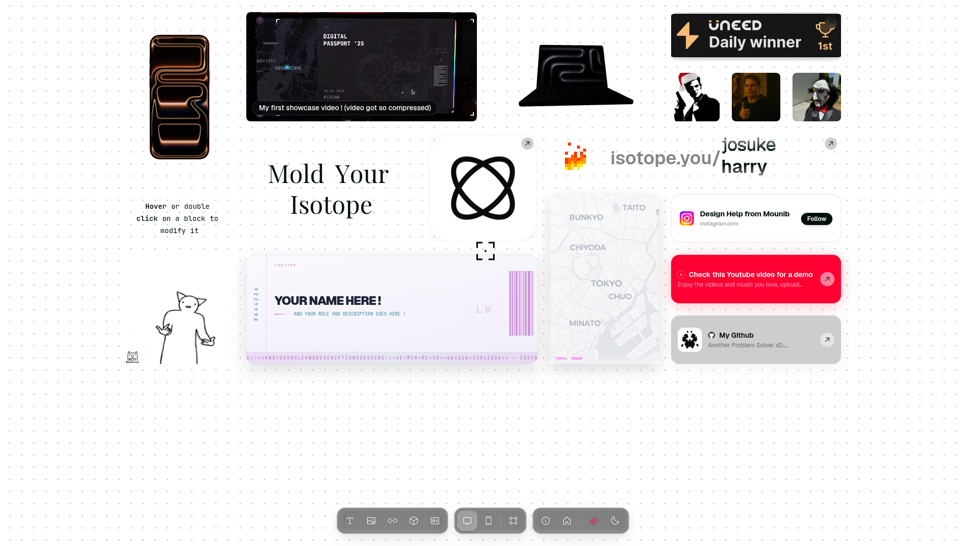
The link-in-bio page has become the internet's most boring real estate. A row of identical buttons, a profile photo, a bio that says "CEO of my own life." Isotope, a new project by Haidar Ezio, doesn't just tweak that formula — it replaces the list with a mosaic grid. The result is a page that feels less like a utility and more like a mood board, a profile, and a digital showcase all at once. The bet is that your links should look like you, not like a directory.

Most link-in-bio tools optimize for conversion: big buttons, clear labels, minimal friction. Isotope optimizes for expression. The core is a drag-and-drop mosaic grid that can hold pictures, links, videos, GIFs, and even 3D blocks representing IRL items. The grid is not a timeline or a feed — it's a spatial canvas where placement and size matter. A link can be a small tile or a large visual block, and the arrangement is entirely up to you. This is a fundamental shift from the list-based paradigm: instead of scanning top-to-bottom, visitors explore left-to-right, zoom in on what catches their eye, and piece together a personality from the fragments.

A mosaic that asks 'you?'

On Isotope's showcase page, there's a row of usernames — harry, ellie, katherine, chrissy — followed by a single word: "you?" It's a small detail, but it reveals the product's core invitation. Isotope isn't just a tool; it's a social canvas where each user is a tile in a larger mosaic. The "you?" is a prompt to claim your spot, to add your own block to the grid. This is more ambitious than a typical profile page. It's an attempt to build a visual network of identities, where the sum is more interesting than any single page. The names themselves — a mix of common and literary (ozymandias, eveline) — suggest a community that values individuality over uniformity.

The tactile grammar of the grid

The interaction model is deceptively simple: hover or double-click on a block to modify it. But the implications are rich. The grid is not just a layout; it's a grammar. You can make a block a link, a photo, a video, or a 3D object. You can resize it, move it, and layer it with effects like the "glass surface filter" that appears throughout the site. This tactile approach — drag, drop, hover, double-click — makes the page feel like a physical object you can rearrange. The showcase includes a GIF of a fire effect and a "Let It Ride" animation, hinting at a suite of "eye-candy effects just for fun." This is not about utility; it's about play. Isotope is building a tool that treats your online presence as something to craft, not just fill out.

Why .you is the right kind of vanity

Isotope's domain is isotope.you, a TLD that most people have never seen. It's a vanity domain, but it's also a statement. The .you TLD reinforces the product's thesis: this is your space, your identity, your rules. It's a small touch, but it signals a willingness to break convention. Most link-in-bio tools are happy with a subdomain like linktr.ee/username. Isotope wants you to own the entire address. The domain also creates a natural pun: "isotope.you" sounds like "isotope you," as if the product is merging with the user. It's clever, and it fits the product's playful, identity-first approach.

What Isotope doesn't tell you (yet)

Isotope's website is more of a showcase than a documentation. There's no pricing page, no feature list, no clear roadmap. The site does show that usernames like "about," "blog," and "pricing" are available, suggesting that the product is still in its early stages. The founder's GitHub shows 33 repositories, but there's no public information about funding, team size, or user numbers. This is a product that is still finding its footing. The lack of a pricing page could mean it's free for now, or that monetization is an afterthought. For a tool that's about identity, the absence of a clear business model is a risk — but it also keeps the focus on the experience. Isotope is a bet on the idea that a visual grid can be more expressive than a list, and that people will want to claim their tile in that grid. Whether that bet pays off depends on whether the mosaic becomes a community, not just a collection of pretty pages.