MiNonna
One-tap video calls that put family first, for older adults and everyone who loves them.
NewName Editorial
Editorial Team


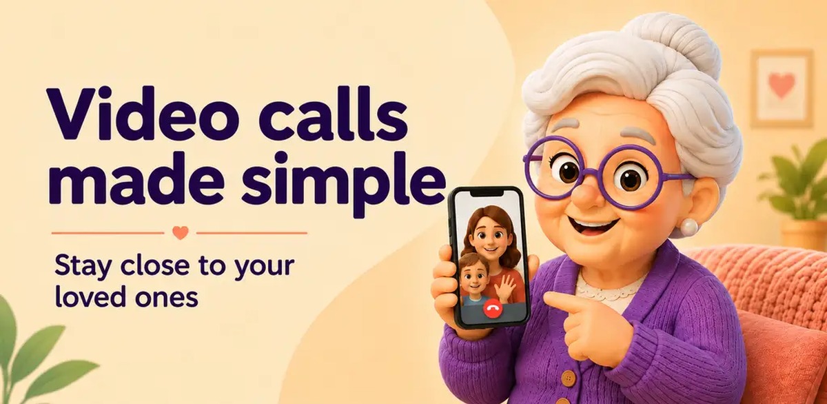
Most video calling apps are built for people who already know how to use them. MiNonna starts from a different question: what if the product adapted to the user instead? The result is a one-tap video calling app for older adults that strips away menus, buttons, and complexity until only the essential remains—a photo to tap, a face to see. It's a bold bet on radical simplicity, and it's worth examining closely.
The one-tap promise
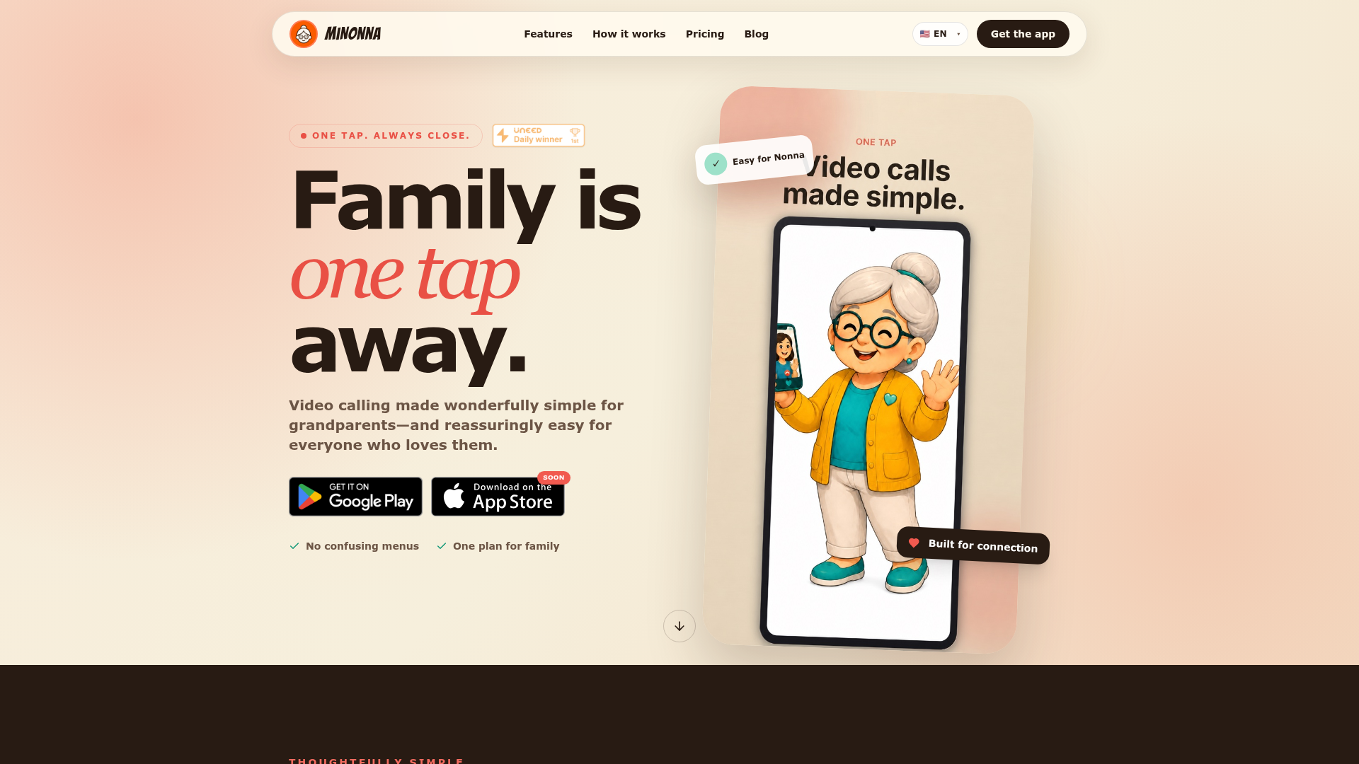
MiNonna's core interaction is deceptively simple: tap a loved one's photo to start a video call. No dial pad, no contact list, no settings to navigate. The app's website emphasizes this with the tagline "One tap. Always close." and the headline "Family is one tap away." This is not just a feature; it's the entire product philosophy. The design removes every possible barrier between intention and connection, which is precisely what older adults need when technology feels intimidating.
The one-tap promise extends beyond the initial call. The app includes features like "loud ringing" and "simple profiles," which are thoughtful touches for users with hearing or vision challenges. The website also mentions "crystal clear video" that works "even on slower internet connections," acknowledging that grandparents may not have the latest broadband. These details show that MiNonna isn't just simplifying an interface—it's engineering for real-world constraints.
Beyond 'easy to use': designing for Nonna
In a blog post titled "'Easy to Use' Still Isn't Easy Enough," MiNonna articulates a critique of the tech industry's default assumption: that users are willing to learn. Most products are designed for people who already understand technology, the post argues. MiNonna starts from a different question: what if products adapted to elderly users instead? This is a subtle but crucial shift. "Easy to use" often means "easy for a 30-year-old to learn," not "easy for an 80-year-old to use without instruction."
MiNonna's approach is to remove learning entirely. The interface shows photos of family members, not a list of contacts. The call starts with a tap, not a sequence of steps. Even the app icon is designed to be recognizable—the Uneed listing notes "shhh...the app icon!" as a playful hint that the icon itself is a call button. This level of attention to the user's mental model is rare in consumer software, and it's what makes MiNonna more than just a stripped-down Skype.
The blog post also suggests that MiNonna's team is thinking deeply about accessibility as a starting point, not an afterthought. This is a product built from the ground up for a specific user, and that focus shows.
The family network as a moat
The family network is MiNonna's structural answer to the problem of scale. The app allows up to 20 family members to connect in a secure, private network. This creates a closed loop: the more family members join, the more valuable the network becomes for everyone. It's a classic network effect, but applied to a very intimate context.
For the elderly user, the family network means they don't have to manage contacts or remember numbers. The family appears as photos, always available. For the adult children, it means a single place to check in on their parents, with the reassurance of end-to-end encryption. The network is also a moat: once a family is set up on MiNonna, switching to another app would require re-creating that circle of trust, which is friction most families won't want to endure.
The website emphasizes that "no tech expert needed"—family members can help with setup and contacts, and after that, MiNonna keeps the experience focused on what matters. This division of labor is smart: the tech-savvy kids handle the configuration, and the grandparents get a simple, reliable experience.
One bill, whole family: pricing as a trust signal
MiNonna's pricing model is as unconventional as its interface. Only the Group Admin pays for the subscription; everyone else joins and video calls for free while the plan is active. This is a deliberate trust signal. It says: we understand that the person who values this most is the one who will pay, and we're not going to nickel-and-dime the grandparents.
The pricing is straightforward: a free 7-day trial, then $9.99 per month or $89.99 per year. The website notes that "local prices load automatically," suggesting a global approach. This simplicity is consistent with the product's philosophy—no tiered plans, no hidden fees, just one bill for the whole family.
However, this model also creates a potential challenge: the paying customer (the adult child) is not the primary user (the grandparent). This is a classic B2B2C dynamic, but in a consumer context. MiNonna must convince the adult child that the value justifies the cost, and that the grandparent will actually use it. The free trial and the family network are designed to address this, but it's a delicate balance.
What the name says before the first tap
The name "MiNonna" is a stroke of branding genius. "Nonna" is Italian for grandmother, a term that evokes warmth, family, and tradition. The "Mi" prefix suggests "my" (as in "my nonna"), making it personal and affectionate. The name immediately signals the target user—grandparents—and the emotional context of the product. It's not a generic name like "FamilyCall" or "SeniorVideo"; it's a name that feels like a term of endearment.
The domain, minonna.app, is short and memorable. The .app TLD reinforces the mobile-first nature of the product. The name also works across languages—the website is available in English, Italian, Japanese, Spanish, Portuguese, and French—and "Nonna" is recognizable in many cultures, even if the specific word differs.
The branding extends to the visual design: the website uses warm colors and imagery of families, and the language is consistently loving ("Made with Love," "just like Nonna's embrace"). This emotional consistency is rare in tech, where products often default to sterile, corporate aesthetics. MiNonna's brand is a promise of care, and the name is the first step in delivering that promise.
The risks and open questions
MiNonna's radical simplicity is also its biggest risk. By stripping away features, it may alienate users who want more control or customization. The app is currently available on Google Play, with an App Store version "coming soon." This limits its reach, especially in markets where iOS is dominant among older adults.
The subscription model, while simple, may be a barrier for some families. The Group Admin pays, but what if the admin is the grandparent themselves? The website doesn't clarify this scenario. Additionally, the app's reliance on the family network means that if one key member doesn't join, the experience is incomplete.
There are also open questions about the competitive landscape. The website lists many "featured on" badges from product directories, suggesting an active launch strategy, but there's no public information about funding or team size. The blog posts indicate a thoughtful team, but the long-term viability of a niche consumer app is uncertain.
Despite these risks, MiNonna's focus on a specific, underserved user group is admirable. It's a product that doesn't try to be everything to everyone; it tries to be everything to one person—the grandmother—and that clarity is its strength. If MiNonna can build a loyal family base, it could become a beloved staple in households, not just another app.
For families with older members, MiNonna is worth a look. It's a product that understands that technology should serve people, not the other way around. And in a world of ever-increasing complexity, that's a refreshing—and necessary—perspective.